Master the difference between vibrance and saturation to supercharge your photos
Mar 14, 2024
Dunja Djudjic
Dunja Djudjic is a multi-talented artist based in Novi Sad, Serbia. With 15 years of experience as a photographer, she specializes in capturing the beauty of nature, travel, and fine art. In addition to her photography, Dunja also expresses her creativity through writing, embroidery, and jewelry making.
Share:
Master the difference between vibrance and saturation to supercharge your photos
Mar 14, 2024
Dunja Djudjic
Dunja Djudjic is a multi-talented artist based in Novi Sad, Serbia. With 15 years of experience as a photographer, she specializes in capturing the beauty of nature, travel, and fine art. In addition to her photography, Dunja also expresses her creativity through writing, embroidery, and jewelry making.
Share on:
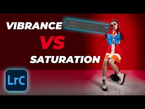
Vibrance and Saturation are two essential tools in your photo editing toolbox. While they might seem similar, understanding their subtle differences can significantly impact the final results. Enter Gareth from Park Cameras. In this tutorial, he’ll guide you through the important differences between these two tools and give you examples of how they work and how you can utilize both for the best result.
Understanding the difference between vibrance and saturation
Both vibrance and saturation affect the intensity of colors in your image. You’ll typically find them in the “basic panel” of most editing software. Here’s the key distinction:
Saturation: This tool takes a broad approach, increasing the saturation of all colors equally. This can be effective for landscapes (as long as you don’t go overboard). However, it might lead to unnatural-looking results, especially in skin tones.
Vibrance: This method offers more targeted control. It focuses on enhancing the saturation of less saturated colors, leaving the already vibrant colors relatively untouched. This is ideal for preserving natural skin tones while adding a gentle color boost. I particularly like Gareth’s example with a very colorful portrait, which is where you can best spot this difference
Effects of vibrance and saturation on different photos
In the video, Gareth goes through a few different images to illustrate how vibrance and saturation work for them.
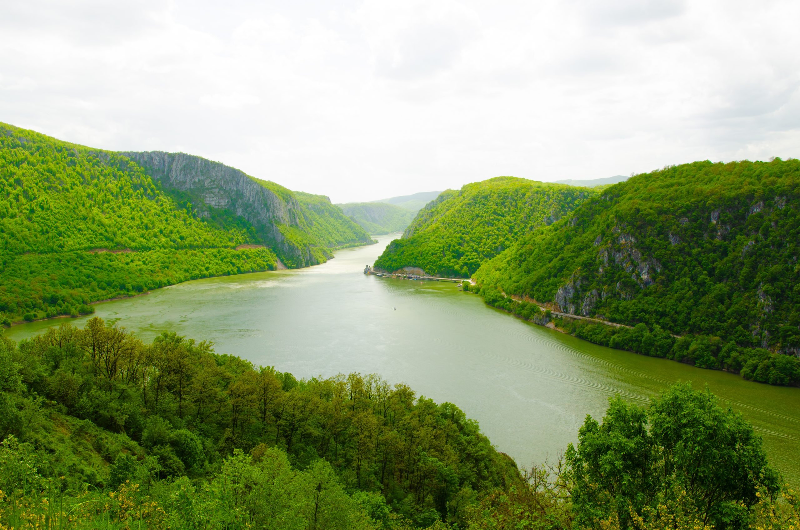
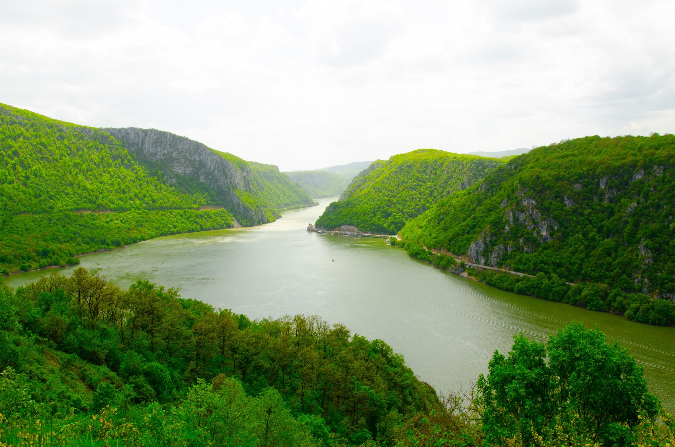
In landscape photos, saturation boosts all colors uniformly, potentially making the sky appear unrealistic. On the other hand, vibrance enhances the blue in the sky while having a lesser impact on other colors, creating a more natural look.
Keep in mind that this doesn’t work the same for all images. A lot depends on the time of day, the lighting of your photo, and so on. Still, Gareth’s photos will give you some general idea. here are my two examples with Vibrance and Saturation cranked all the way up to 100 in Lightroom (don’t try this at home :)).
In portrait photos, saturation can oversaturate skin tones, making them appear unnatural. On the other hand, vibrance subtly increases the vibrancy of the image while protecting skin tones from oversaturation.
How to use vibrance and saturation
If you’ve concluded so far that saturation is an undesirable tool, let me note that it’s not the case. Both tools have their use and purpose, and Gareth suggests a general rule of thumb, which I also follow in my edits:
Start your adjustments with vibrance: it’s a safer option as it offers more control over the color enhancement process. If you need an overall color boost, use saturation as well. Just be careful not to overuse it as it will give your images a very unnatural look.
Advanced techniques
If you want even more control, you can play with the HSL and Calibration panels. The HSL panel allows for precise control of individual colors’ saturation, hue, and lightness. When I want to increase saturation in Lightroom, this is the tool I normally use. You can also use the Calibration panel, which enables fine-tuning the saturation of specific color channels (red, green, and blue).
Conclusion
Understanding the distinction between vibrance and saturation empowers you to make informed decisions while editing your photos. Remember, though, that experimentation is key! Try both vibrance and saturation on different photos to understand their effects. Play around, pay attention to how your photos change, and enjoy the process.
[Vibrance VS Saturation – What’s The Difference? | Tutorial Tuesday via FStoppers]

Dunja Djudjic
Dunja Djudjic is a multi-talented artist based in Novi Sad, Serbia. With 15 years of experience as a photographer, she specializes in capturing the beauty of nature, travel, and fine art. In addition to her photography, Dunja also expresses her creativity through writing, embroidery, and jewelry making.
Related Posts
 Learn the difference between saturation and vibrance to create better photographs
 Yes, saturation and vibrance are different things and here’s how they both work
 Can you tell the difference between these film and digital photos?
 Can you tell the difference between $5,500 full frame vs iPhone XS photos?
Join the Discussion
DIYP Comment Policy
Be nice, be on-topic, no personal information or flames.